
Graphic design and photography are closely interconnected disciplines that work together to create effective visual…
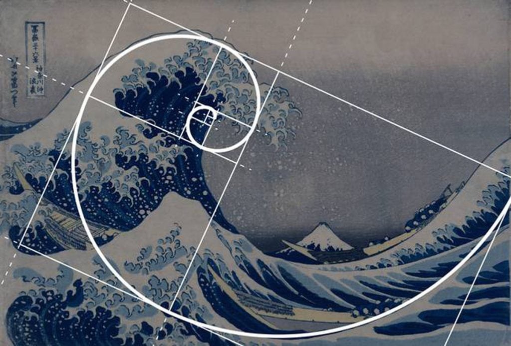
The Language of Visual Composition
Visual composition is the structured arrangement of visual elements within a design to communicate meaning, guide perception, and create aesthetic harmony. Just as spoken language uses grammar and syntax to convey ideas, visual composition uses principles such as balance, hierarchy, alignment, contrast, and proportion to organize visual information effectively. This structured arrangement allows designers and artists to communicate messages clearly and influence how viewers interpret and experience visual content. Visual composition is the foundation of graphic design, photography, fine art, and digital media (Arnheim, 1974; Lupton & Phillips, 2015).
Visual composition transforms visual elements into meaningful communication.
It is the grammar of visual language.
Understanding Visual Composition as a Language
Visual composition functions as a language because it uses visual elements to communicate ideas. These elements include:
- Line
- Shape
- Color
- Texture
- Space
These elements form the vocabulary of visual communication, while composition organizes them into meaningful visual structures (Wong, 1993).
Composition gives structure to visual elements.
Structure enhances communication clarity.
Visual organization improves perception.
Composition supports visual meaning.
Design communicates visually.
Composition strengthens visual effectiveness.
Visual Hierarchy: Organizing Information
Visual hierarchy refers to the arrangement of elements in order of importance. Hierarchy guides the viewer’s eye and determines how information is read and interpreted (Lidwell et al., 2010).
Designers create hierarchy using:
- Size differences
- Color contrast
- Position
Hierarchy improves readability.
Hierarchy guides viewer attention.
Hierarchy strengthens communication clarity.
Hierarchy enhances usability.
Hierarchy supports visual organization.
Hierarchy improves comprehension.
Hierarchy directs perception.
Balance: Creating Visual Stability
Balance refers to the distribution of visual weight in a composition. Balanced compositions feel stable and visually comfortable (Arnheim, 1974).
There are two types of balance:
- Symmetrical balance
- Asymmetrical balance
Balance improves visual harmony.
Balance enhances readability.
Balanced composition strengthens visual structure.
Balance improves visual clarity.
Stability enhances user experience.
Balance supports perceptual organization.
Balanced design improves communication effectiveness.
Contrast: Creating Visual Distinction
Contrast refers to differences between visual elements that make them distinguishable. Contrast improves readability and emphasis (Ware, 2013).
Contrast can be created using:
- Color differences
- Size differences
- Light and dark values
Contrast improves visual clarity.
Contrast enhances visual hierarchy.
Contrast strengthens communication effectiveness.
Contrast improves usability.
Contrast enhances visual interest.
Contrast guides viewer attention.
Contrast improves readability.
Alignment: Creating Visual Order
Alignment refers to the arrangement of elements along a visual axis. Alignment creates visual order and improves readability (Samara, 2007).
Proper alignment improves:
- Visual organization
- Communication clarity
Alignment enhances visual structure.
Alignment strengthens visual consistency.
Alignment improves usability.
Alignment supports visual hierarchy.
Alignment improves visual flow.
Alignment enhances perception.
Alignment strengthens composition.
Proportion: Establishing Visual Relationships
Proportion refers to the size relationships between visual elements. Proper proportion enhances balance and harmony (Lupton & Phillips, 2015).
Proportion improves visual hierarchy.
Proportion enhances aesthetic quality.
Proportion strengthens visual organization.
Proportion improves communication clarity.
Proportion enhances visual harmony.
Size relationships improve perception.
Proportion enhances usability.
Proportion strengthens visual effectiveness.
Space: Creating Visual Clarity
Space refers to the area around and between visual elements. Space improves readability and visual organization (Lupton & Phillips, 2015).
There are two types of space:
- Positive space
- Negative space
Space improves visual clarity.
Space enhances visual hierarchy.
Space strengthens visual organization.
Space improves communication effectiveness.
Space reduces cognitive load (Ware, 2013).
Space enhances readability.
Space improves user experience.
Space strengthens visual focus.
Movement: Guiding Visual Flow
Movement refers to how the viewer’s eye travels through a composition. Designers guide eye movement intentionally using visual cues (Ware, 2013).
Movement improves visual navigation.
Movement enhances communication clarity.
Movement strengthens visual structure.
Movement improves user experience.
Movement enhances visual flow.
Movement improves comprehension.
Movement supports perceptual organization.
Movement strengthens communication effectiveness.
Unity: Creating Visual Cohesion
Unity refers to how visual elements work together to create a cohesive composition. Unity ensures that all elements appear connected and purposeful (Arnheim, 1974).
Unity improves visual harmony.
Unity enhances communication clarity.
Unity strengthens visual structure.
Unity improves visual organization.
Unity enhances aesthetic quality.
Unity strengthens communication effectiveness.
Unity improves user experience.
Unity enhances visual consistency.
Rhythm: Creating Visual Pattern
Rhythm refers to the repetition of visual elements to create consistency and pattern. Rhythm enhances visual harmony (Wong, 1993).
Rhythm improves visual organization.
Rhythm enhances visual clarity.
Rhythm strengthens visual structure.
Rhythm improves communication effectiveness.
Rhythm enhances aesthetic quality.
Rhythm improves usability.
Rhythm strengthens visual harmony.
Rhythm enhances visual flow.
Composition and Human Perception
Visual composition aligns with how the human brain processes visual information. The brain organizes visual input based on contrast, grouping, and hierarchy (Ware, 2013).
Composition improves cognitive processing.
Composition enhances visual clarity.
Composition improves comprehension.
Composition strengthens communication effectiveness.
Composition enhances usability.
Composition supports perception.
Composition improves user experience.
Composition strengthens visual understanding.
Visual Composition in Digital and Graphic Design
Visual composition is essential in modern design, including:
- Graphic design
- UI/UX design
- Motion graphics
Composition improves usability and communication effectiveness (Norman, 2013).
Composition enhances digital communication.
Composition improves user interaction.
Composition strengthens visual clarity.
Composition enhances user experience.
Composition supports visual hierarchy.
Composition improves usability.
Composition strengthens communication effectiveness.
Composition enhances visual organization.
Conclusion
Visual composition is the language through which visual communication occurs. It organizes visual elements into structured and meaningful arrangements that guide perception, enhance clarity, and communicate ideas effectively.
Composition transforms visual elements into visual communication.
Understanding composition allows designers to create effective and meaningful visual experiences.
Visual composition aligns with human perception and cognitive processing.
Design communicates through visual structure.
Composition is essential for effective visual communication.
Visual composition remains the foundation of graphic design and visual arts.
It is the grammar of visual communication.
References
Arnheim, R. (1974). Art and visual perception: A psychology of the creative eye. University of California Press.
Lidwell, W., Holden, K., & Butler, J. (2010). Universal principles of design (Rev. ed.). Rockport Publishers.
Lupton, E., & Phillips, J. C. (2015). Graphic design: The new basics (2nd ed.). Princeton Architectural Press.
Norman, D. A. (2013). The design of everyday things (Revised and expanded ed.). Basic Books.
Samara, T. (2007). Grid systems: Principles of organizing type. Rockport Publishers.
Ware, C. (2013). Information visualization: Perception for design (3rd ed.). Morgan Kaufmann.
Wong, W. (1993). Principles of form and design. John Wiley & Sons.

Related Posts


This Post Has 0 Comments