
Graphic design and photography are closely interconnected disciplines that work together to create effective visual…
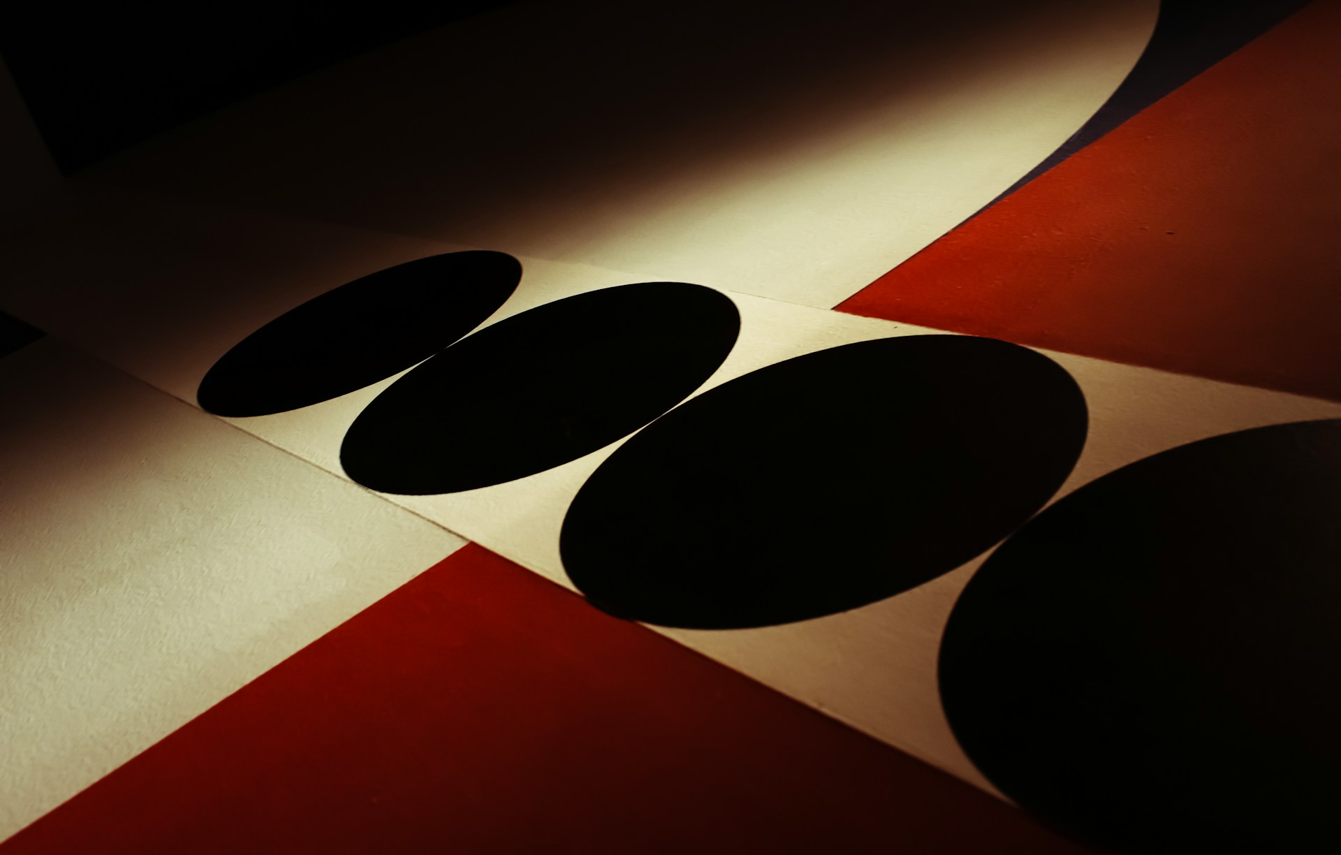
Elements of Design Explained: From Theory to Practice
Design is not created by accident. Every effective visual composition—from logos and posters to websites and user interfaces—is built upon a structured system of visual components known as the elements of design. These elements form the foundation of visual communication, allowing designers to organize information, guide perception, and create meaningful visual experiences (Lupton & Phillips, 2015).
The elements of design include line, shape, form, color, value, texture, and space. These elements serve as the visual vocabulary of design, enabling designers to communicate ideas clearly and effectively. Understanding how these elements function in theory and applying them in practice is essential for visual graphic designers and visual artists alike (Ambrose & Harris, 2011).
Understanding the Elements of Design as Visual Language
The elements of design function similarly to words in a language. Individually, they carry meaning. When combined thoughtfully, they create coherent visual messages (Wong, 1993).
Designers use these elements to:
- Organize visual information
- Establish hierarchy
- Guide viewer attention
- Communicate emotion and meaning
Without a clear understanding of design elements, visual compositions may appear disorganized or ineffective (Ware, 2013).
The transition from theory to practice involves not only recognizing these elements but applying them intentionally to achieve specific communication goals.
Line: Creating Structure and Direction
Line is the most basic element of design. It is defined as a path created by a moving point and serves as the foundation for shapes, forms, and structures (Wong, 1993).
In practice, lines are used to:
- Divide space
- Organize content
- Guide the viewer’s eye
- Create visual hierarchy
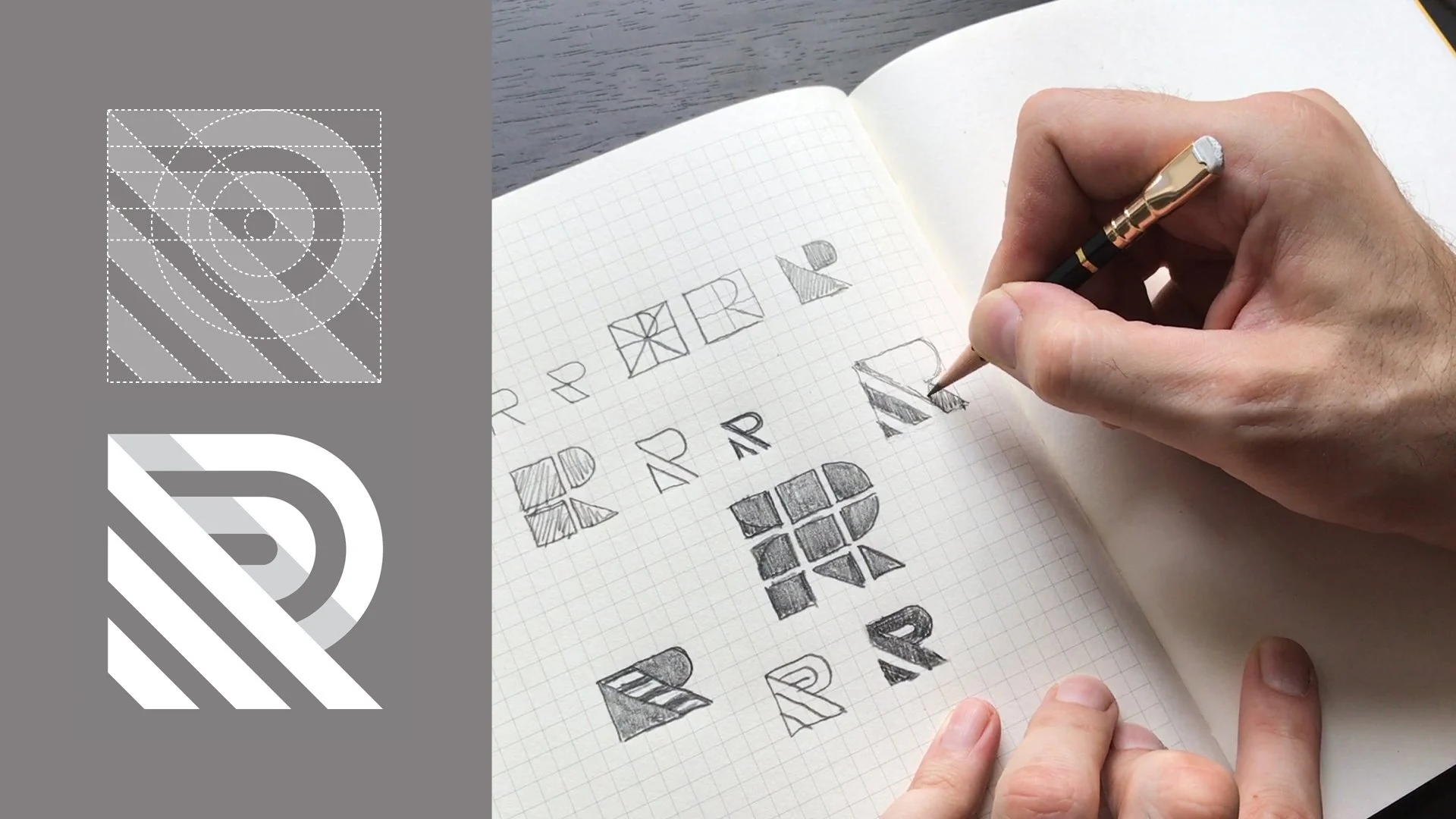
For example, in layout design, lines separate sections of content and improve readability. In logos and illustrations, lines create form and identity (Lidwell et al., 2010).
Lines also communicate emotion. Straight lines often suggest stability and order, while curved lines suggest softness and movement.
Shape: Building Visual Identity
Shape refers to a two-dimensional area defined by boundaries such as lines, color, or contrast (Lupton & Phillips, 2015).
Designers use shapes to create recognizable visual structures, including:
- Logos
- Icons
- Interface elements
- Layout components
Shapes fall into three main categories:
- Geometric shapes (squares, circles, triangles)
- Organic shapes (natural, irregular forms)
- Abstract shapes (simplified or symbolic forms)
In practice, shapes help establish brand identity and visual clarity (Ambrose & Harris, 2011).
For example, circular shapes often communicate unity and harmony, while rectangular shapes communicate stability and structure.
Form: Creating Depth and Dimension
Form refers to three-dimensional objects or the illusion of three-dimensionality on a two-dimensional surface (Wong, 1993).
Designers create the illusion of form using:
- Light and shadow
- Gradients
- Perspective
- Scale variation
In practical applications such as digital interfaces, form helps create visual cues that suggest interactivity. Buttons appear raised or recessed, helping users understand how to interact with them (Norman, 2013).
Form enhances realism and improves visual engagement.
Color: Communicating Emotion and Meaning
Color is one of the most influential elements in visual design. It communicates emotion, establishes mood, and enhances brand recognition (Ware, 2013).
Color has three primary attributes:
- Hue (the color itself)
- Value (lightness or darkness)
- Saturation (intensity)
In practice, designers use color to:
- Establish visual hierarchy
- Improve readability
- Communicate brand identity
- Influence emotional response
For example, warm colors such as red and orange convey energy and urgency, while cool colors such as blue and green convey calmness and trust (Ambrose & Harris, 2011).
Color decisions directly affect user perception and behavior.
Value: Creating Contrast and Emphasis
Value refers to the relative lightness or darkness of visual elements (Wong, 1993).
Value plays a critical role in:
- Creating contrast
- Improving readability
- Establishing hierarchy
High contrast between text and background improves legibility, especially in digital environments (Ware, 2013).
Designs that lack value contrast often appear flat and difficult to read.
Value helps viewers distinguish between foreground and background elements.
Texture: Adding Visual Interest and Realism
Texture refers to the surface quality of an object, either physical or visual (Ambrose & Harris, 2011).
In graphic design, texture is usually implied visually rather than physically.
Designers use texture to:
- Add visual depth
- Create realism
- Enhance visual interest
For example, subtle grain or noise in digital design prevents surfaces from appearing overly flat and artificial (Lupton & Phillips, 2015).
Texture enhances sensory engagement and visual richness.
Space: Organizing Visual Relationships
Space refers to the area around and between design elements. It includes both positive space (occupied areas) and negative space (empty areas) (Lupton & Phillips, 2015).
Space is essential for:
- Improving readability
- Creating balance
- Highlighting important elements
Effective use of negative space improves clarity and allows viewers to focus on key information (Lidwell et al., 2010).
Minimalist design relies heavily on space to create elegance and sophistication.
Space is not empty; it is an active design element.
From Theory to Practice: Applying the Elements of Design
Understanding design elements theoretically is only the first step. Effective design requires practical application.
Designers apply these elements to:
- Create visual hierarchy
- Improve usability
- Guide viewer attention
- Communicate messages clearly
For example, in website design:
- Line organizes layout structure
- Shape defines interface components
- Color establishes brand identity
- Space improves readability
- Value ensures contrast
- Texture enhances visual depth
Each element contributes to overall visual effectiveness (Norman, 2013).
Design success depends on how effectively these elements work together.
Elements and Principles: Working Together
The elements of design serve as building blocks, while the principles of design provide organizational guidelines (Lidwell et al., 2010).
Design principles include:
- Balance
- Contrast
- Emphasis
- Movement
- Unity
- Proportion
Designers use elements to implement these principles.
For example, contrast is achieved using value and color differences. Balance is achieved using spatial arrangement.
Elements and principles function as an integrated system.
The Role of Design Elements in Visual Communication
Design elements are essential for effective visual communication. They shape how viewers interpret and respond to visual information (Ware, 2013).
Well-applied design elements:
- Improve clarity
- Enhance usability
- Strengthen emotional impact
- Support communication goals
Poor application results in confusion, visual clutter, and ineffective communication.
Design elements transform visual content into meaningful communication.
Conclusion
The elements of design form the foundation of visual communication. They provide designers with the tools needed to organize information, guide perception, and communicate ideas effectively.
Understanding these elements in theory provides knowledge. Applying them in practice creates effective design.
Design is not simply decoration. It is the intentional arrangement of visual elements to achieve communication goals.
For visual graphic designers, mastering the elements of design is essential. It transforms creativity into structured, purposeful visual communication.
The elements of design are not optional techniques. They are the core language of visual design itself.
References
Ambrose, G., & Harris, P. (2011). The fundamentals of graphic design (2nd ed.). Bloomsbury Publishing.
Lidwell, W., Holden, K., & Butler, J. (2010). Universal principles of design (Rev. ed.). Rockport Publishers.
Lupton, E., & Phillips, J. C. (2015). Graphic design: The new basics (2nd ed.). Princeton Architectural Press.
Norman, D. A. (2013). The design of everyday things (Revised and expanded ed.). Basic Books.
Ware, C. (2013). Information visualization: Perception for design (3rd ed.). Morgan Kaufmann.
Wong, W. (1993). Principles of form and design. John Wiley & Sons.

Related Posts


This Post Has 0 Comments