
Graphic design and photography are closely interconnected disciplines that work together to create effective visual…
How the Human Eye Reads a Layout
Effective graphic design is not based solely on aesthetics but on understanding how the human visual system perceives and processes information. The human eye does not view a layout randomly; instead, it follows predictable patterns guided by visual hierarchy, contrast, alignment, and spatial organization. Designers use principles derived from visual perception, cognitive psychology, and Gestalt theory to control how viewers scan and interpret visual information. Understanding how the eye reads a layout allows designers to create compositions that communicate clearly and efficiently (Ware, 2013; Lidwell et al., 2010).
Design is not only about what is seen—but about how it is seen.
The Human Visual System and Information Processing
The human visual system is highly efficient but limited in capacity. Visual perception begins when light enters the eye and is processed by the brain, which interprets shapes, colors, contrast, and spatial relationships (Ware, 2013).
The brain prioritizes visual information based on:
- Contrast
- Size
- Position
- Movement
This process allows viewers to quickly identify important elements.
Visual perception is selective.
The brain organizes visual information efficiently.
Design must align with perceptual processes.
Eye Movement and Visual Scanning Patterns
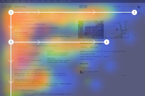
Research shows that viewers do not read layouts linearly. Instead, the eye scans layouts in patterns based on structure and visual hierarchy (Nielsen, 2006).
Two common scanning patterns include:
The F-Pattern
The F-pattern is common when reading text-heavy layouts such as websites or articles. The viewer scans horizontally across the top, then moves down and scans shorter horizontal lines.
This pattern resembles the letter “F.”
The F-pattern is influenced by reading habits.
Designers place important information along this scanning path.
This improves communication effectiveness.
The Z-Pattern
The Z-pattern is common in simpler layouts such as advertisements. The eye moves in a Z-shaped path:
- Top left to top right
- Diagonally down to the bottom left
- Across to the bottom right
This pattern guides visual flow.
Designers place key elements along this path.
The Z-pattern improves visual organization.
Layouts align with natural eye movement.
Visual Hierarchy and Attention
Visual hierarchy determines the order in which viewers see information. The eye naturally focuses on elements that stand out visually (Lidwell et al., 2010).
Hierarchy is created using:
- Size
- Contrast
- Color
- Position
Larger and higher-contrast elements attract attention first.
Hierarchy guides viewer attention.
Hierarchy improves communication clarity.
Design controls viewing order.
Visual hierarchy directs perception.
Contrast and Visual Emphasis
Contrast is one of the strongest tools for controlling eye movement. High contrast elements attract attention immediately (Ware, 2013).
Contrast can be created using:
- Color differences
- Size differences
- Light and dark values
Contrast separates important elements from background elements.
Contrast improves readability.
Contrast creates visual focus.
Designers use contrast to guide attention.
Contrast enhances visual clarity.
The Role of White Space in Eye Movement
White space, also known as negative space, plays a critical role in guiding eye movement. White space separates elements and improves readability (Lupton & Phillips, 2015).
White space helps the eye:
- Focus on key elements
- Navigate layouts easily
Crowded layouts increase cognitive load.
White space improves visual clarity.
Space supports perceptual organization.
White space enhances usability.
Space improves comprehension.
Gestalt Principles and Visual Organization
Gestalt principles explain how the brain organizes visual information into meaningful groups (Lidwell et al., 2010).
Key Gestalt principles include:
- Proximity
- Similarity
- Continuity
These principles help viewers interpret layouts quickly.
The brain groups related elements automatically.
Gestalt principles improve layout clarity.
Design aligns with perceptual organization.
Gestalt principles enhance usability.
Perception influences design effectiveness.
Alignment and Visual Flow
Alignment creates visual order and structure. Proper alignment allows the eye to move smoothly across a layout (Samara, 2007).
Alignment improves:
- Visual organization
- Readability
Poor alignment disrupts eye movement.
Alignment creates visual consistency.
Design structure guides perception.
Alignment improves usability.
Structured layouts enhance clarity.
Alignment supports visual flow.
Color and Attention
Color influences eye movement and attention. Bright and saturated colors attract attention more strongly than neutral colors (Ware, 2013).
Color helps:
- Highlight important elements
- Guide viewer focus
Color improves visual hierarchy.
Color enhances visual communication.
Color influences perception.
Designers use color strategically.
Color supports visual emphasis.
Color enhances readability.
Typography and Reading Behavior
Typography plays a critical role in how the eye reads text. Readable typography improves comprehension and reduces cognitive effort (Lupton, 2010).
Typography affects:
- Reading speed
- Readability
Clear typography improves visual flow.
Typography supports effective communication.
Readable text enhances comprehension.
Typography guides eye movement.
Design improves reading efficiency.
Typography enhances usability.
Visual Balance and Stability
Balance refers to the distribution of visual weight in a layout. Balanced layouts feel stable and organized (Arnheim, 1974).
Balance improves:
- Visual comfort
- Perceptual stability
Unbalanced layouts create visual tension.
Balance enhances readability.
Balanced design improves user experience.
Visual balance supports clarity.
Structure enhances perception.
Balance improves communication effectiveness.
Cognitive Load and Layout Simplicity
Cognitive load refers to the mental effort required to process visual information. Simple layouts reduce cognitive load and improve comprehension (Ware, 2013).
Designers reduce cognitive load through:
- Clear hierarchy
- Limited visual complexity
Simple layouts improve usability.
Clarity enhances perception.
Design supports cognitive efficiency.
Simplicity improves communication.
Reduced cognitive load enhances user experience.
Clarity improves understanding.
Practical Applications in Graphic and UI/UX Design
Understanding eye movement helps designers create effective layouts in:
- Website design
- Print design
- User interface design
Designers use visual hierarchy, contrast, and alignment to guide user attention (Norman, 2013).
Effective layouts improve usability.
Visual structure enhances communication.
Design aligns with human perception.
Layout design improves interaction.
Perception guides design decisions.
Visual organization enhances usability.
Conclusion
The human eye reads layouts according to predictable perceptual and cognitive patterns. Designers use visual hierarchy, contrast, alignment, color, and space to guide eye movement and improve communication effectiveness.
Understanding how the human eye reads a layout allows designers to create clear, organized, and effective visual communication.
Design is not random—it is guided by human perception.
Effective design aligns with how the brain processes visual information.
Visual structure improves readability, usability, and comprehension.
Design succeeds when it works with human perception—not against it.
Understanding visual perception is essential for effective graphic design.
References
Arnheim, R. (1974). Art and visual perception: A psychology of the creative eye. University of California Press.
Lidwell, W., Holden, K., & Butler, J. (2010). Universal principles of design (Rev. ed.). Rockport Publishers.
Lupton, E. (2010). Thinking with type: A critical guide for designers, writers, editors, and students (2nd ed.). Princeton Architectural Press.
Lupton, E., & Phillips, J. C. (2015). Graphic design: The new basics (2nd ed.). Princeton Architectural Press.
Nielsen, J. (2006). F-shaped pattern for reading web content. Nielsen Norman Group.
Norman, D. A. (2013). The design of everyday things (Revised and expanded ed.). Basic Books.
Samara, T. (2007). Grid systems: Principles of organizing type. Rockport Publishers.
Ware, C. (2013). Information visualization: Perception for design (3rd ed.). Morgan Kaufmann.

Related Posts


This Post Has 0 Comments