
Graphic design and photography are closely interconnected disciplines that work together to create effective visual…
The Psychology of Color in Visual Design
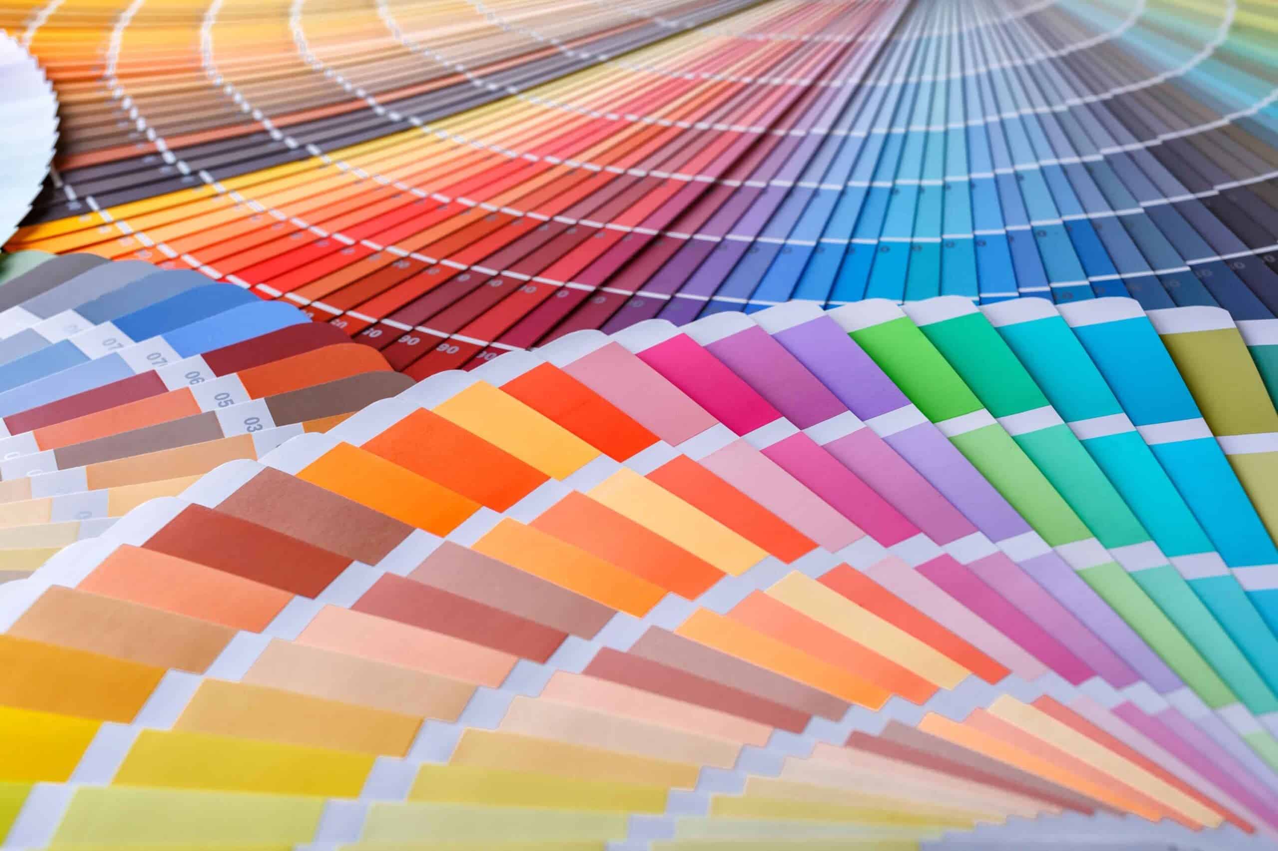
Color is one of the most powerful tools in visual design because it directly influences perception, emotion, and behavior. The human brain processes color rapidly, often forming judgments and emotional responses within milliseconds of viewing a visual stimulus. Designers use color strategically to communicate meaning, guide attention, establish identity, and influence user experience. Understanding the psychology of color allows designers to create visual communication that is both aesthetically effective and psychologically impactful (Ware, 2013; Lidwell et al., 2010).
Color is not merely decorative. It is a functional and psychological component of visual communication.
How the Human Brain Perceives Color
Color perception begins when light enters the eye and stimulates photoreceptor cells in the retina. These signals are transmitted to the brain, which interprets them as color (Ware, 2013).
The brain processes color quickly, often before shape or text.
Color perception helps viewers:
- Recognize objects
- Identify importance
- Respond emotionally
This rapid processing makes color an effective communication tool.
Color enhances visual efficiency.
Perception is influenced by color.
Color guides visual interpretation.
Emotional Responses to Color
Colors evoke emotional responses based on both biological and cultural associations. These responses influence mood, perception, and behavior (Lidwell et al., 2010).
Common emotional associations include:
- Red: energy, urgency, passion
- Blue: calmness, trust, stability
- Yellow: optimism, attention, warmth
- Green: growth, balance, nature
- Black: power, elegance, authority
- White: purity, simplicity, cleanliness
These emotional responses influence how viewers interpret visual messages.
Color affects emotional perception.
Emotion strengthens communication effectiveness.
Color enhances psychological impact.
Color and Visual Attention
Color plays a critical role in directing visual attention. Bright and high-contrast colors attract attention more effectively than neutral colors (Ware, 2013).
Designers use color to:
- Highlight important elements
- Create focal points
High-contrast colors improve visibility and readability.
Color improves visual hierarchy.
Attention follows color contrast.
Color enhances visual emphasis.
Color guides eye movement.
Visual attention is influenced by color.
Color and Visual Hierarchy
Visual hierarchy refers to the organization of elements based on importance. Color is one of the most effective tools for establishing hierarchy (Lupton & Phillips, 2015).
Designers use color to:
- Emphasize primary information
- De-emphasize secondary information
For example:
- Bright colors highlight important elements
- Neutral colors reduce emphasis
Hierarchy improves readability.
Color supports organizational clarity.
Color strengthens visual structure.
Hierarchy enhances communication efficiency.
Color and Brand Identity
Color plays a central role in brand identity. Organizations use color to communicate personality, values, and emotional tone (Meggs & Purvis, 2016).
Color helps create:
- Brand recognition
- Emotional connection
For example:
- Blue is often used to communicate trust and professionalism
- Red is used to communicate energy and excitement
Consistent color use strengthens brand identity.
Color enhances brand recognition.
Color communicates brand meaning.
Color supports visual identity.
Brand perception is influenced by color.
Cultural Influence on Color Meaning
Color meanings vary across cultures. Cultural context influences how colors are interpreted (Gombrich, 1995).
For example:
- White symbolizes purity in some cultures and mourning in others
- Red symbolizes celebration in some cultures and danger in others
Designers must consider cultural context when selecting colors.
Cultural awareness improves communication effectiveness.
Color meaning depends on cultural interpretation.
Design must align with audience expectations.
Cultural context influences perception.
Color communicates cultural meaning.
Color Contrast and Readability
Color contrast improves readability and usability. High contrast between text and background enhances visibility (Ware, 2013).
Poor contrast reduces readability.
Designers use contrast to:
- Improve legibility
- Enhance usability
Contrast strengthens communication clarity.
Color contrast improves accessibility.
Readability enhances user experience.
Contrast supports visual clarity.
Color improves information processing.
Color Harmony and Visual Balance
Color harmony refers to the pleasing arrangement of colors. Harmonious color combinations create visual balance and aesthetic appeal (Lidwell et al., 2010).
Common color harmony systems include:
- Complementary colors
- Analogous colors
Color harmony enhances aesthetic quality.
Balanced color improves visual comfort.
Harmony strengthens visual communication.
Color harmony enhances design effectiveness.
Visual balance improves perception.
Color harmony supports aesthetic clarity.
Color and User Experience (UX)
Color plays a critical role in user experience design. Color helps users navigate interfaces and understand functionality (Norman, 2013).
Color improves:
- Navigation clarity
- User interaction
For example:
- Green buttons often indicate confirmation
- Red buttons indicate warnings
Color improves usability.
Color enhances interface clarity.
Visual communication supports user interaction.
Color strengthens user experience.
UX depends on visual clarity.
Color improves functional communication.
Color and Cognitive Processing
Color improves cognitive processing by helping users organize and understand information more efficiently (Ware, 2013).
Color helps users:
- Identify important elements
- Process information quickly
Color reduces cognitive load.
Visual clarity improves comprehension.
Color enhances cognitive efficiency.
Design supports perceptual processing.
Color improves information organization.
Cognitive processing is influenced by color.
Color in Digital and Print Design
Color functions differently in digital and print environments. Digital design uses light-based color systems (RGB), while print design uses pigment-based systems (CMYK) (Lupton & Phillips, 2015).
Designers must understand color systems to ensure consistency.
Color accuracy enhances communication effectiveness.
Color consistency strengthens visual identity.
Digital and print color differ technically.
Design must consider color reproduction.
Color management supports visual accuracy.
Color as a Tool for Visual Storytelling
Color enhances visual storytelling by communicating mood, atmosphere, and narrative meaning (Meggs & Purvis, 2016).
Designers use color to:
- Create emotional tone
- Enhance narrative clarity
Color strengthens storytelling effectiveness.
Color communicates visual meaning.
Storytelling benefits from color psychology.
Color enhances narrative communication.
Visual stories depend on color.
Color strengthens emotional engagement.
Conclusion
Color psychology plays a fundamental role in visual design by influencing perception, emotion, attention, and behavior. Designers use color strategically to enhance communication, improve usability, and create emotional connection.
Color strengthens visual hierarchy, prove readability, and enhances user experience.
Understanding color psychology allows designers to create effective and meaningful visual communication.
Color is not merely aesthetic—it is psychological.
Effective design uses color intentionally.
Color shapes perception, communication, and experience.
Understanding color psychology is essential for successful visual design.
References
Gombrich, E. H. (1995). The story of art (16th ed.). Phaidon Press.
Lidwell, W., Holden, K., & Butler, J. (2010). Universal principles of design (Rev. ed.). Rockport Publishers.
Lupton, E., & Phillips, J. C. (2015). Graphic design: The new basics (2nd ed.). Princeton Architectural Press.
Meggs, P. B., & Purvis, A. W. (2016). Meggs’ history of graphic design (6th ed.). Wiley.
Norman, D. A. (2013). The design of everyday things (Revised and expanded ed.). Basic Books.
Ware, C. (2013). Information visualization: Perception for design (3rd ed.). Morgan Kaufmann.

Related Posts


This Post Has 0 Comments