
Graphic design and photography are closely interconnected disciplines that work together to create effective visual…
Visual Hierarchy: Guiding Attention with Design
In visual arts and graphic design, viewers do not absorb everything at once. Instead, the eye follows a path of attention, moving from one element to another in a predictable order. This deliberate ordering of visual importance is known as visual hierarchy. It is one of the most powerful tools designers use to ensure clarity, emphasis, and effective communication.
Visual hierarchy transforms a composition from a collection of elements into a readable visual experience—one that guides viewers toward what matters most (Lidwell, Holden, & Butler, 2010).
What Is Visual Hierarchy?
Visual hierarchy refers to the arrangement of visual elements in a way that influences the order in which they are noticed and processed. It determines:
- What the viewer sees first
- What captures attention next
- What information is remembered
Research in perception shows that humans instinctively seek structure and prioritization when viewing images, especially in information-rich designs (Ware, 2013). Without hierarchy, layouts feel confusing, overwhelming, or visually flat.
Why Visual Hierarchy Matters
Effective visual hierarchy:
- Improves comprehension and readability
- Reduces cognitive load
- Enhances user experience
- Directs behavior and decision-making
In digital environments, where attention spans are short, hierarchy is critical. Users typically scan rather than read, relying on visual cues to decide where to focus (Nielsen, 2006).
Key Tools Used to Create Visual Hierarchy
1. Size and Scale
Larger elements attract attention first. Headlines, hero images, and primary calls-to-action dominate because of their size.
Studies on visual salience confirm that scale is one of the strongest predictors of attention (Ware, 2013). Designers use size to immediately signal importance.
2. Color and Contrast
High-contrast elements stand out against their surroundings. Bright colors against neutral backgrounds naturally draw the eye.
Color contrast not only improves visibility but also reinforces hierarchy by separating primary from secondary information (Lidwell et al., 2010).
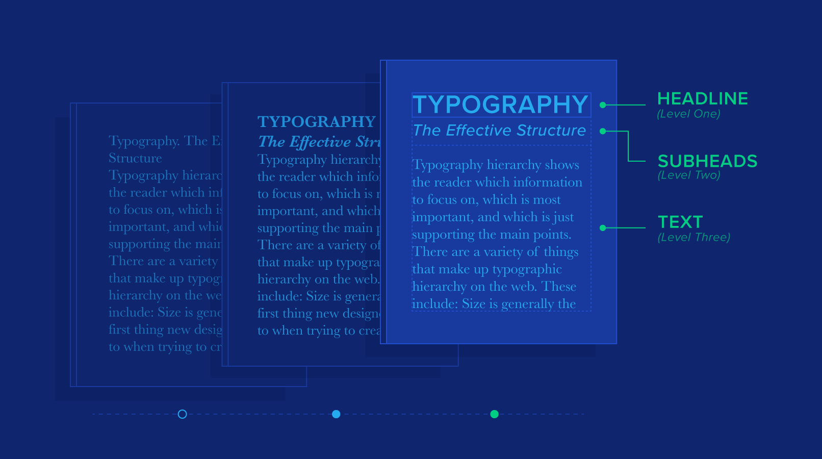
3. Typography and Weight
Font size, weight, and style play a central role in hierarchy.
- Bold and large type signals importance
- Lighter or smaller text suggests supporting content
Typography establishes a reading order that mirrors spoken emphasis—what should be read first, second, and last (Bringhurst, 2013).
4. Position and Alignment
Elements placed at the top or center of a layout tend to be seen first, particularly in cultures that read left-to-right and top-to-bottom.
Eye-tracking studies reveal common scanning patterns, such as the F-pattern and Z-pattern, especially in web design (Nielsen, 2006). Designers exploit these patterns to place critical information where attention naturally lands.
5. Space and Isolation
White space (negative space) increases emphasis by isolating elements. The more space around an object, the more important it appears.
This principle reduces visual clutter and helps viewers focus on what matters most (Lidwell et al., 2010).
6. Repetition and Consistency
Repeating visual styles—such as consistent headings, colors, or icons—creates predictable hierarchy across pages or sections.
Consistency trains users to recognize importance quickly, improving usability and comprehension (Norman, 2013).
Visual Hierarchy and Human Perception
Visual hierarchy is grounded in perceptual psychology. The brain seeks patterns, contrast, and order to minimize effort when interpreting visual information (Ware, 2013). When hierarchy is clear, viewers experience less cognitive strain and process information more efficiently.
Poor hierarchy, on the other hand, forces users to work harder—often leading to disengagement.
Applications Across Visual Design
Visual hierarchy is essential in:
- Posters and print layouts
- Branding and advertising
- Web and UI/UX design
- Editorial and publication design
- Infographics and data visualization
Across all mediums, the goal remains the same: guide attention with intent.
Conclusion
Visual hierarchy is the invisible structure behind effective design. It controls how information is discovered, understood, and remembered. For visual graphic designers and visual arts practitioners, mastering hierarchy means mastering communication itself.
Design is not about making everything visible—it is about making the right things visible first.
When hierarchy is intentional, design becomes intuitive. When it is ignored, even the most beautiful visuals fail to communicate.
References (APA 7th Edition)
Bringhurst, R. (2013). The elements of typographic style (4th ed.). Hartley & Marks.
Lidwell, W., Holden, K., & Butler, J. (2010). Universal principles of design (2nd ed.). Rockport Publishers.
Nielsen, J. (2006). F-shaped pattern for reading web content. Nielsen Norman Group. https://www.nngroup.com/articles/f-shaped-pattern-reading-web-content/
Norman, D. A. (2013). The design of everyday things (Revised and expanded ed.). Basic Books.
Ware, C. (2013). Information visualization: Perception for design (3rd ed.). Morgan Kaufmann.

Related Posts


This Post Has 0 Comments