
Graphic design and photography are closely interconnected disciplines that work together to create effective visual…
The Psychology of Color: How Leading Brands Use Color to Influence Perception
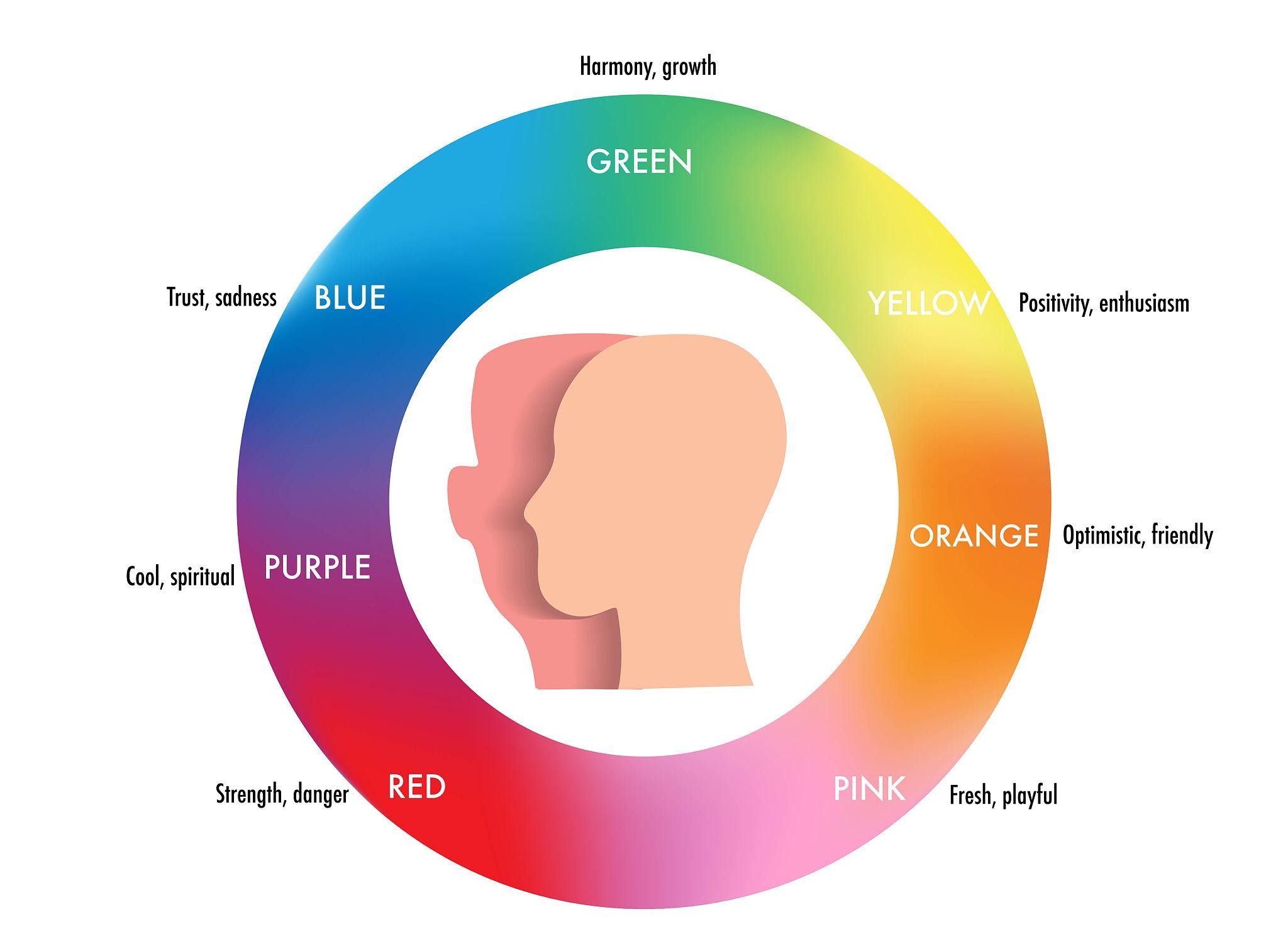
Color is never just decoration. In visual communication, color is psychology made visible. It shapes first impressions, triggers emotional responses, and silently influences decisions—often within seconds. For visual graphic designers and enthusiasts, understanding color psychology is essential to creating designs that do more than look good: designs that work (Elliot & Maier, 2014).
Prominent global brands have long mastered this language, using color strategically to communicate trust, urgency, innovation, or comfort—without saying a word (Kauppinen-Räisänen & Luomala, 2010).
Why Color Psychology Matters
Human brains process color before text or form. Research shows that color significantly affects:
- Brand recognition
- Emotional response
- Perceived value and trust
- Purchasing decisions
Studies suggest that up to 90% of snap judgments about products may be influenced by color alone (Singh, 2006). For designers, this means color choice is not subjective preference—it is strategic intent.
Red: Energy, Urgency, and Appetite
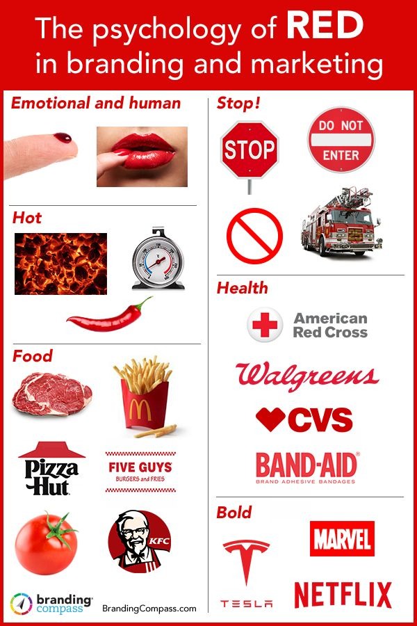
Red is associated with energy, passion, urgency, and stimulation. It increases heart rate and creates a sense of immediacy (Elliot & Maier, 2014).
Brands that use red effectively include Coca-Cola, which employs red to reinforce excitement, happiness, and appetite, and Netflix, which uses red to signal bold entertainment and emotional intensity (Singh, 2006).
Red is commonly applied in call-to-action elements, food branding, and entertainment platforms because it encourages rapid engagement.
Blue: Trust, Stability, and Intelligence
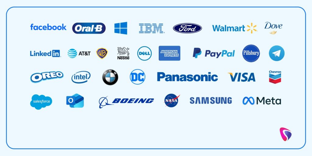
Blue conveys trust, reliability, calmness, and professionalism. It is one of the most widely used colors in corporate identity systems (Labrecque & Milne, 2013).
Companies such as Facebook and IBM use blue to communicate dependability, intelligence, and long-term stability. Blue is particularly dominant in technology, finance, healthcare, and corporate services, where trust is critical (Kauppinen-Räisänen & Luomala, 2010).
Yellow: Optimism, Warmth, and Attention
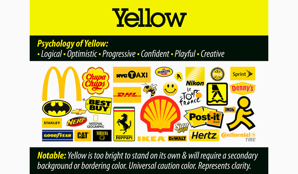
Yellow evokes optimism, warmth, and happiness, while also being one of the most attention-grabbing colors (Singh, 2006). When overused, however, it can cause visual fatigue.
Brands like McDonald’s use yellow to stimulate appetite and visibility, while IKEA balances yellow with blue to combine friendliness with trust (Labrecque & Milne, 2013).
Green: Growth, Health, and Sustainability
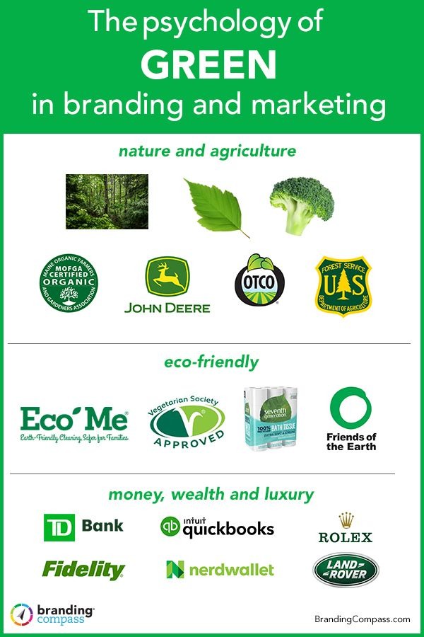
Green represents nature, balance, health, and renewal. It is often associated with ethical behavior and environmental responsibility (Elliot & Maier, 2014).
Brands such as Starbucks and Whole Foods use green to reinforce values of sustainability, wellness, and community, making it particularly effective in food, finance, and health-related industries.
Black: Power, Elegance, and Authority
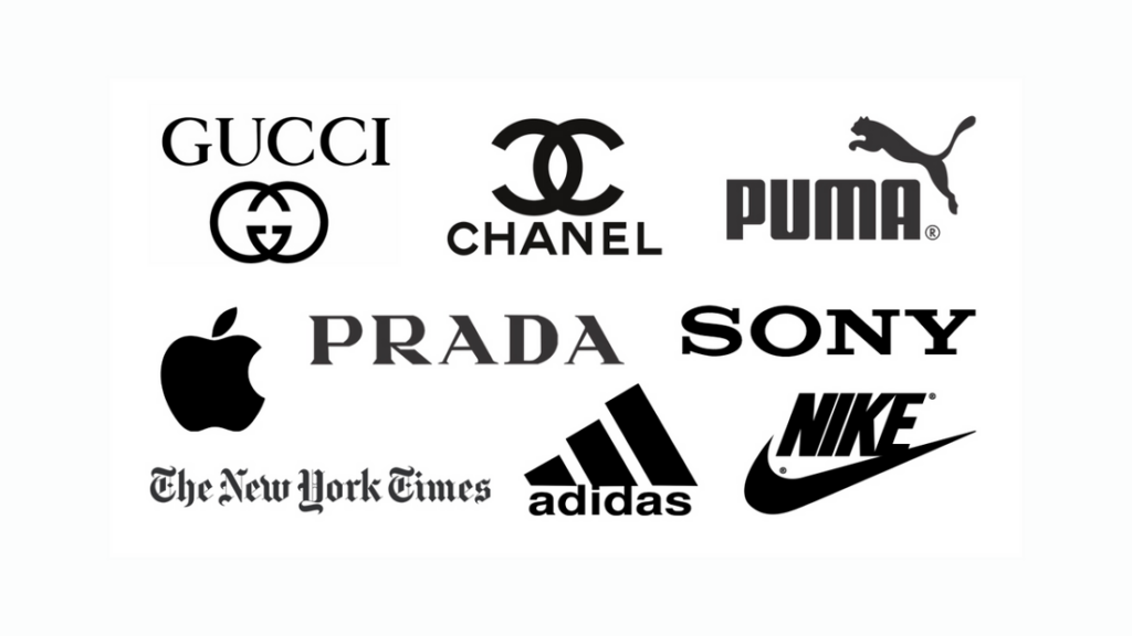
Black communicates authority, sophistication, luxury, and modernity. It is frequently used to position brands as premium or high-status (Labrecque & Milne, 2013).
Brands such as Apple and Nike leverage black to enhance perceptions of innovation, confidence, and performance.
Purple: Creativity, Imagination, and Prestige
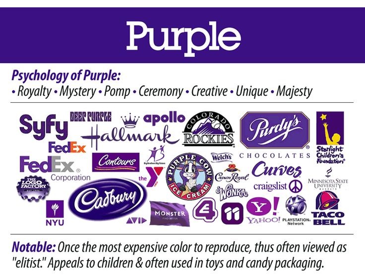
Purple combines the stability of blue with the energy of red, symbolizing creativity, imagination, and prestige (Singh, 2006).
Brands such as Cadbury use purple to suggest richness and indulgence, while Twitch uses it to represent creativity and digital culture.
Color as Brand Language
Successful brands do not apply color randomly. Instead, they develop consistent color systems that account for cultural meaning, emotional impact, accessibility, and long-term brand recognition (Kauppinen-Räisänen & Luomala, 2010).
Over time, color becomes inseparable from brand identity—often recognized even without logos or text.
What This Means for Designers
For visual graphic designers and enthusiasts, color psychology transforms design from decoration into strategy. Color shapes perception before content is read, influencing trust, emotion, and behavior almost instantly (Elliot & Maier, 2014).
Conclusion
Color is one of the most powerful tools in visual design—not because it is beautiful, but because it is psychological. Prominent companies succeed not merely through aesthetics, but through deliberate color choices aligned with human perception, emotion, and cultural meaning.
Great design begins when color is chosen with intention, insight, and understanding.
References (APA 7th Edition)
Elliot, A. J., & Maier, M. A. (2014). Color psychology: Effects of perceiving color on psychological functioning in humans. Annual Review of Psychology, 65, 95–120. https://doi.org/10.1146/annurev-psych-010213-115035
Kauppinen-Räisänen, H., & Luomala, H. T. (2010). Exploring consumers’ product-specific colour meanings. Qualitative Market Research: An International Journal, 13(3), 287–308. https://doi.org/10.1108/13522751011053644
Labrecque, L. I., & Milne, G. R. (2013). To be or not to be different: Exploration of norms and benefits of color differentiation in the marketplace. Marketing Letters, 24, 165–176. https://doi.org/10.1007/s11002-012-9200-5
Singh, S. (2006). Impact of color on marketing. Management Decision, 44(6), 783–789. https://doi.org/10.1108/00251740610673332

Related Posts


This Post Has 0 Comments